
Why Your Brand Palette Is A Frequency Map (And How to Tune It)
- LXR

- Aug 21, 2025
- 3 min read
Updated: Nov 3, 2025
When most people think about brand design, they think aesthetics: colors, shapes, typography. But behind aesthetics lies something deeper: frequency.
Every color is more than pigment. It is vibration—light slowed down enough for the eye to receive it. Your brand palette is not simply decoration; it is a frequency map. It signals who you are before a single word is read.
Color as Language of the Soul
Ancient cultures knew this well. Egyptians wrapped their temples in lapis and gold not just for beauty, but because blue invoked cosmic truth, while gold radiated divine illumination. Sufis saw green as the color of renewal and the bridge to paradise.

Today, modern psychology tells us red excites, blue calms, and yellow sparks joy. But beyond psychology, there is myth. Each hue carries a story, a vibration, a resonance.
Your Palette as Tuning Fork
When your brand chooses a color, it is striking a note. Combine colors, and you compose a chord. This chord either rings in harmony with your essence—or jars against it.
Think of your brand palette as a tuning fork. These are your root notes:
Red → Vitality, courage, ignition.
Blue → Trust, depth, cosmic listening.
Green → Renewal, growth, harmony with nature
Gold → Abundance, illumination, sacred value.
Black → Mystery, elegance, infinite potential.
White → Clarity, new beginnings, spaciousness.
The palette you choose will echo in the nervous systems of those who encounter you. It either clarifies your frequency—or blurs it.
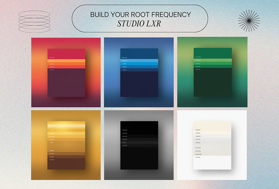
Build Your Chord (Supporting Frequencies)
These are the notes that give your root color dimension, nuance, and contrast.
Yellow → Joy, illumination, optimism, solar warmth
Orange → Creativity, courage, community, life-force energy
Purple → Vision, mystery, sovereignty, spiritual authority
Pink (soft) → Compassion, tenderness, emotional openness
Pink (vibrant/fuchsia) → Bold love, passion, playful magnetism
Grey → Balance, neutrality, timeless sophistication
Earth Tones (ochres, browns, muted greens) → Grounding, ancestral wisdom, stability
Vibrant Tones (electric hues, neons) → Futurism, disruption, high-activation signals

How to Tune Your Brand Palette
Start with Essence: Ask, What is the feeling I want others to carry after touching this brand? Write three words.
Choose the Root Note: Pick one core color that embodies this essence. This is your “root frequency.”
Build the Chord: Add 2–3 supporting tones that amplify but don’t compete. Think harmony, not chaos.
Check for Resonance: Look at the palette as a whole. Does it hum? Or does it feel fragmented?
Design as Frequency Work
At Studio LXR, we treat color not as surface, but as signal. When aligned, your palette becomes more than design—it becomes a frequency field, quietly attuning the world to your message.
Because design isn’t just how something looks. It’s how it vibrates.
Next Step: Brand Archetype Soul Work
Colors are the first layer of your brand’s frequency. The deeper map is your archetype—the mythic role your brand plays in the world. If this guide resonated, we invite you into our signature Brand Archetype Reading. Together, we’ll decode your essence, translate it into story, and design a visual and strategic language that feels alive.
FREE DOWNLOAD: Visual Frequency Map A Guide to Finding Your Brand's Color Palette (PDF)

Studio LXR: Design as Frequency.

![Studio LXR featured in we[dot]art’s Curated Creative Directory](https://static.wixstatic.com/media/ab82fd_597ae351bfe743a9bdd47794537ec59a~mv2.jpg/v1/fill/w_980,h_662,al_c,q_85,usm_0.66_1.00_0.01,enc_avif,quality_auto/ab82fd_597ae351bfe743a9bdd47794537ec59a~mv2.jpg)

Comments